Brief 4
This was an audio inspired visual piece using all of my own footage. It was all shot on one Samsung Digimax S500 camera. I used the song “Momma Sed” by Puscifer – a side project band of Maynard James Keenan, known better for his work with the bands Tool and A Perfect Circle. After using my own music and other people’s images in briefs 2 and 3, I thought that this time I would change it around and see how well I could do providing visuals to an existing song.
Since first hearing this song, I always thought of what possible visual elements could accompany it. I think that it is a hard-hitting, powerful song and this is largely down to the vocals and lyrical content. So, I thought of ways I could make the lyrics stand out to the viewer even more. Some influence for my idea came from the Bob Dylan video for his song Subterranean Homesick Blues. Although extremely simple, holding up pieces of paper with some of the words on was effective and made me listen to what was being said more closely than I usually would have. As I wanted the lyrics in the song I chose to stand out, I took the idea from the Bob Dylan video and adapted it and made it my own. Instead of just having one man holding them up, I got 2 males and 2 females to take turns holding the pieces of paper up, to make things more interesting and dynamic. Also, instead of just having some of the words like in the Bob Dylan video, I used all of the lyrics. This was so the viewer can take it all in and have no confusion over anything that is being sang. The original video of this song was unfortunately recently taken down from YouTube. This is the closest I could get. Although there are people talking over it you can see the video and where my ideas came from.
For me, the Puscifer song is an overview of life in general and how it will have it’s ups and downs and not always go the way you want, but you must overcome your problems and continue forward. It says to me that life is one long journey. So, to show this side of my thinking I had another person simply walk. It represents the journey. Starting from the top of a long lane and walking down, I filmed him from various angles, making use of long shots, mid shots and close ups. I chose to have him wear sunglasses and fairly simple clothing so it could essentially be anyone and viewers will feel like it could just as easily be them.
After finishing all of the small videos, I used Windows Movie Maker to edit them all into place. First of all I needed to make sure that the correct lyric cards were being held up on screen at the right time with the song. I then slotted the various clips of ‘the walker’ in between them and focused on making the video flow. I ended up using most of the videos I recorded with the exception of a small few. My thinking was that it was better to get more than you need instead of not having enough. There were two final versions of the video, one with the old effect and one without. I watched both and got some other people’s opinions before deciding to use the one with the effect. There were three old effects -old, older and oldest. I chose the middle one as it was most effective in my opinion. I finally added slow motion in certain parts to add effect.
Overall I am happy with the outcome of this project. Not only did it give me some experience in devising visual ideas for audio pieces but it also gave me experience in shooting a video by myself. As well as teaching me new skills it was also very enjoyable to do. Since doing this I have experimented with other songs and thought of various video ideas for them too. In the future if I were to do something like this again, I would use both my own music and own footage and if I had more time I would experiment with more complexed ideas and methods.
.
Brief 3
For this brief, I was asked to create a montage using a series of still images. We then had to include sound/music and some sort of narrative to tell a story. I chose to use the 1979 cult classic film ‘The Warriors’ for this project. It is one of my favourite films of all time and I thought it would work well for this task. As I used a film, the narrative is already there. So, I took stills from the film, thinking about the most important and iconic scenes and images. I then created my own piece of music which I thought would represent the film and capture the gritty, late 70’s New York feeling. When putting this with the images, I had to do some editing to make sure everything was in time. I wanted the drums and loudness of it to come in more when there is a threat and it to quiet down when there are calmer moments. The film sees the gang trying to get home through New York when every other gang in the city is after them so I tried to capture that sense of uncertainty and danger and keep it constant.
I am happy with the outcome of this project and I think that the music accompanies the images nicely. It captures the 1970’s New York feeling and helps the images in telling the story. If I were to do it again I would take more time on the editing process making sure that every picture changes at the correct intervals. However, overall I am pleased with the piece and enjoyed doing it and may do more in my own time, perhaps using my own images so I can continue to build upon the techniques I have learnt.
.
Brief 2
Choose and research a work of 2-dimentional visual art that you like or inspires you. Take time to research the meaning or intention of the artist in making the work. Carry out applied research into the works and history of the artist in order gain further insight. The work could be a painting, mixed media, photograph etc and should offer you enough information by which to express the work through sound and/or music.
After a period of research consider how you will synthesise the information and findings into sound and music.
I have chosen to look at a piece of art called ‘The Dinner Party by Jules Grun. Here is some more info on him.
Jules-Alexandre Grün (25 May 1868 – 15 February 1934) was a French post-impressionist painter, poster artist, and illustrator.
Grun’s best known painting is called The Dinner Party, produced in 1911. It was, however, in the fields of poster art and illustration art, for which he was famous. He was employed at a large printing company in Paris and his artistic director was Jules Cheret. Cheret was also his main competitor in poster art.
This is him:

And this is his ‘The Dinner Party‘

Here is the piece of music I created to go with this image:
I got a real sense of tension and bitterness when looking at this image. I tried to portray this in the music. There is only one person smiling but we don’t know if this is a real smile or an attempt to avoid what is going on between the other people. This may be a good reason she has her back turned from it all too. Perhaps the man talking to her is trying to distract her from what is going on. In the other parts of the room there seems to be serious conversations going on.
At the back, there is a crowd of people surrounding what looks like a conversation between the old man sitting down and the woman leaning on the table. None of them look particularly happy and if you look behind, there is another woman holding her hands on her head, suggesting there is a problem. Judging by the way the woman is standing and the man in the chair is cowardly sitting back, it seems that it is him that has done something wrong and that he has been caught.
In the bottom corner of the painting, there is a smaller conversation going on between three people. Again, none of them are laughing or smiling, behaviour you would usually expect at a dinner party. The woman is pointing at the one man, perhaps accusing him of something? Also, behind them is a mysterious looking man who isn’t interacting with any of the other people there. He has a sense of guilt or shame about him.
In terms of structure for this piece of music, I started with typical dinner party sounds (people entering, the sound of multiple conversations and people eating and cutting their food). I then brought in the sinister sounds to accompany the mood of this painting, which makes up the majority of the piece. It builds up, then slows down to then build back up even more. I then end it on a sound that suggests the issues were resolved. The party is over and what’s happened has happened.
I feel that this piece was a success and that the music represented the image well. It didn’t need anything over the top or extravagant but instead something to simply set the mood of the dinner party. I made two different pieces of music for it but decided on this one as the other one lacked the depth and feeling of what I thought this image was about. There could have been different ways to approach this depending on what you think when looking at the image. I thought what I did was a fair representation of my feelings when looking at it.
.
First Task
I was asked to look at different ways that musicians, record labels, festivals, gigs and the like are represented through visual media. Here are some examples I looked at:
Tool
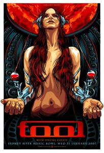
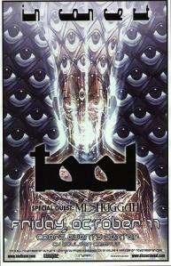
Tool. One of my favourite bands. They choose not to appear in their own music videos. Instead they create imagery they feel accompanies the music better. Their live shows are something to behold. I have included a video below to give you an example. They project a series of images on large screens, having the focus on that instead of themselves. Similar to their videos, they believe this imagery is more important to look at than themselves. The singer, Maynard James Keenan, even stands at the back of the stage in the dark at some shows so nobody can focus on him as he is largely against the ‘rockstar’ persona.
I have included images of their lives shows, gig posters and album covers. Their album covers are often dark, detailed and hypnotic. Their surrealism draws you in and captures your attention. It seems that their gig posters have a similar approach. They embrace the unknown and I find that their image is one of the most interesting I have come across.


Greenman Festival
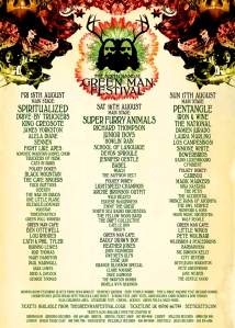
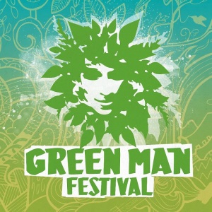
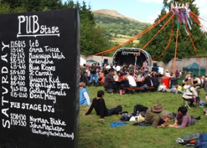
The Greenman Festival is an independent music festival held annually in the Brecon Beacons, Wales. It includes folk, indie and dance music, literature, film and theatre, as well as bonfires and comedy. It is a very natural feeling festival. I think they portray this on their posters. I have included a couple of examples below. They use natural feeling colours like green and brown, giving it that earthy feel. Their logo is the man’s head surrounded by leaves (also included below), which again is an obvious representation of nature. I hope to go to this year Greenman and I will be able to see first hand if their posters and advertisement adequately portrays what the festival is all about. As you can see on the last image the stage times are done using chalk, again a very traditional approach, avoiding the use of any technology.
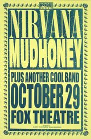
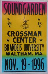
90’s ‘Grunge’
The 90′s. An interesting and wild time for music. It saw the popularity of glam rock and hair rock come to an end, as well as the popularity of synth pop. It was time for a new approach. Bands like Oasis and Blur were highly successful and genres such as drum and bass saw a rise in popularity. However, one particular style that came into the public eye was Grunge. It was controversial, in your face and dirty. However, that didn’t stop it becoming a huge success..
I had a browse through different grunge bands gig posters. I noticed that they used a very simplistic style. As you can see on the examples below, there are only 1 or 2 colours used on each one (with the exception of the Soundgarden one). Also, there are not many images. Grunge was a style that wasn’t about the images but instead the music did the talking. These examples use fairly vibrant colours, but like I mentioned, only 1 or 2 at a time.

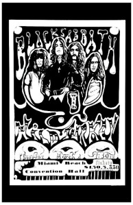
Black Sabbath
Black Sabbath. A band I like and have been lucky enough to see live. Their use of dark, occult themed images and text have inspired generations of new artists. Here is a page with a few examples. Enjoy.
http://www.blisshq.com/test/album-covers/Black%20Sabbath.html